
Design
![]() 19 min read
19 min read
Bridging the Analytics Gap: Why We Are Reimagining Our Client Data Experience

Table of Contents
The Challenge: Embedded Analytics That Fall Short
At Artera, we’ve consistently prioritized providing our clients with powerful data insights. Until recently, we’ve relied on embedded Looker dashboards to deliver analytics within our application. While this solution has served its purpose, we’ve identified several critical issues that prevent us from delivering the seamless experience our clients deserve.
Disconnected User Experience
Our embedded Looker dashboards stood out, and not in a good way. The styling discrepancy created a jarring experience as users navigated from our carefully designed interface to dashboards that look and feel completely different. This visual disconnect undermined the premium, cohesive experience we strived to provide.
Accessibility Concerns
As we continued to prioritize inclusive design, we grew increasingly concerned about the accessibility limitations of our current embedded dashboard solution. We’re committed to ensuring all users, regardless of ability, can effectively access and utilize our analytics features. Strong accessibility was a concern with our previous implementation.
Limited Usage Insights
We also lacked visibility into how our clients interact with the previous dashboards. Without the ability to track usage patterns, we missed crucial insights that could help us improve the analytics experience based on real user behavior.
Constrained Customization
Our clients deserve the ability to create and customize data visualizations that feel like a natural extension of our platform. They were limited to predefined dashboards that don’t offer the flexibility or integrated appearance they need.
Considered Options
Before settling on our path forward, we thoroughly evaluated several approaches to address these challenges:
1. Creating Custom Looker Pages with Looker Extensions
While this approach would allow for some customization, it presented significant drawbacks:
- Would require maintaining a separate code repository from our existing application code
- Would create a management divide between application developers and data developers
- Resulting pages would still need to be embedded in our application code, maintaining some level of disconnect
2. Creating Custom Looker Themes
This option offered limited improvements:
- Only works with embedded Dashboards, not solving all our integration issues
- Very limited in what can be customized, constraining our design options
- Would be managed within Looker’s admin page, separate from our development workflow
- Resulting dashboards would still need to be embedded in our application code
3. Custom Visualizations
This approach emerged as our preferred solution due to several advantages:
- Completely customizable, giving us full control over the user experience
- Could be embedded as single view Looks without requiring a full Dashboard
- Could be used by customers from within Looker with their own Looks or Dashboards
- Code resides within our application codebase, simplifying maintenance
- Enables integration of our own tooling, including usage tracking
However, there were still challenges with this approach:
- Very little documentation or code examples
- Complete lack of documentation on how to implement Visualization options from within Looker
- Two layers of iframe’s when embedding into our web application as Looker embeds the Visualization inside it’s own iframe creating some layout control challenges
Final Decision
After careful consideration, our decision fell on using Custom Visualizations because it offered complete customization and aligned with our core objectives:
- We could offer our customers data visualizations that seamlessly integrate into our application look and feel, creating a unified experience that maintains our brand identity throughout the entire user journey
- We could add usage tracking capabilities that provide valuable insights into how clients interact with their data, enabling us to make data-driven improvements
- We can better manage accessibility compliance by building visualizations that adhere to WCAG standards from the ground up, ensuring all users can effectively engage with their data
- We have better separation of concerns between Data and Application development and security, allowing our teams to work within their domains of expertise
This approach represents the optimal balance between technical feasibility, user experience enhancement, and organizational efficiency.
Resulting Custom Visualizations Stack
Our implementation of custom Visualizations consists of several integrated components that work together to create a seamless experience. Following the summary sections we will give some short code examples of how we created a custom Visualization of a BarChart with React, MUI, and Looker. We also include links to documentation and code examples where we can.
As far as the authentication needed to embed a Looker Look or Dashboard into a standalone web application, please refer to Looker’s Embed docs. We found the best and easiest method was to use the Embed SDK.
Custom Visualizations
- Small React applications for each chart type are created and hosted within our SaaS application
- Uses the same component framework, MUI, as our application
- Expands upon the component framework with MUI Charts for data components
- Uses the same style of theming as our application, ensuring visual consistency
Configure Looker Application to Use Custom Visualizations
- Within Looker Admin, add hosted URL for each Custom Visualization as the Embed setting
- This allows our visualizations to be used as standard options within Looker’s interface
Create Looker Look to Populate the Custom Visualization with Data
- Select the visualization name from Embed settings
- Adjust the Visualization settings as needed for the desired layout
- This maintains the data processing capabilities of Looker while leveraging our custom display
Embed Look with Custom Visualization into Our Application Code
- Use embed URL to create secure login and iframe of Look
- Setup filters to allow users to interact with and customize their data view
- The result is a seamlessly integrated analytics experience that appears native to our application
Examples:
1: Starting with the base React app – https://github.com/looker-open-source/custom_visualizations_v2/blob/master/docs/api_reference.md.
This MD file will give you the building blocks you need on how the React app is initialized from within the Look as a Visualization. For our implementation we used the following as the base starting point –

There is no import for the looker reference, their embed process includes looker on the Window object.
chartOptions is our created class used to manage the editable options/config from within the Look. Every time the Look configuration is changed, the updateAsync is triggered. We found we needed to grab the existing config and information from queryResponse.fields.measures, and sending the changes with the object newOptions to the call back – which updates the Visualization options with the registerOptions event. This is used to configure look and feel within the Look presentation.
For example, in Looker, the Look Visualization settings as an Edit option where you can change options.
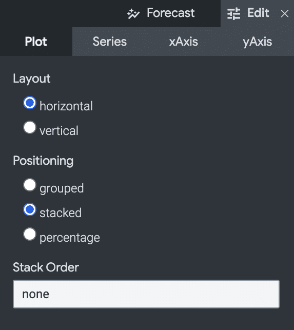
To control the BarChart prop used to change the bar layout of the MUI component, we have a config option that toggles between horizontal and vertical. When the configuration under Edit is changed, updateAsync is triggered with the new values in the config prop object. We send the config to our wrapping BarChart component BarChartVisualization . In BarChartVisualization, we can modify as needed for proper formation to send along to the MUI BarChart component.
The reason we use chartOptions.onUpdate is we found needs with some configuration where we needed to pull out items like field names – so we could offer those field names as mapping names for name simplification/overwriting. It does cause a ‘double render’ – but only when the editor is configuring the Visualization for the Look. This does not happen in the runtime embedded version.
2: Standalone App and Configuration in Looker – https://cloud.google.com/looker/docs/marketplace-develop-visualization
Looker has a marketplace for Visualizations, but also allows you to build your own and use them privately. Using the same principles as creating a Visualization for their marketplace, we created a publicly hosted file for our BarChart Visualization above. Publicly hosing the shell code is secure in that it never receives data outside of Looker. Within Looker, we then configured Looker to use our hosted Visualization under the Admin/Visualizations configuration:

The directions found here show how to configure the visualization into the Look: https://cloud.google.com/looker/docs/reference/param-manifest-visualization#example_adding_a_custom_visualization_url_to_your_lookml_project
3: Embedded the Look into our web application.
The Looker Embed SDK documentation is a good reference on how to securely embed the custom Visualizations – https://cloud.google.com/looker/docs/embed-sdk-intro and https://github.com/looker-open-source/embed-sdk.
We wanted as much granular control on look and feel as we could achieve, so we only used Looks as apposed to Dashboards when embedded within our web application. We also stripped as much as possible from the native Looker iframe by creating a custom theme within Looker, turning off all the options possible.

The created theme can be added to embedded Look with the .withTheme or the method used to create the embedded login URL.
Below shows a basic component used to render the embedded URL as the custom Visualization. useLook returns the Look URL and renders the iframe.

Example Results

Comparison of the older Dashboards with the new custom Visualizations
Directly below is a snippet of our older embedded Looker dashboard. The dashboard disadvantages were:
- Limited control of the dashboard header, and options
- No control on filter button style, color, or size
- No control on drop shadow, bar style, or spacing
- Slower perceived render time as all reports needed to finish before the dashboard fully rendered

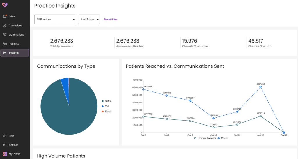
And finally – the new analytic reports using our custom Visualizations
- Full control of the header
- Full control of the filters, what’s displayed and button style and colors
- Better control of the chart options like labels, spacing, icons
- Better Accessibility compliance
- Much faster perceived load times as each individual report renders individually
Moving Forward: Our Vision for Integrated Analytics
We believe analytics shouldn’t feel like an afterthought or third-party add-on. That’s why we’ve reimagined our approach to client data visualization with a focus on:
- Seamless visual integration that maintains design consistency throughout the entire user journey
- Accessibility-first architecture that allow all users to effectively interact with data
- Comprehensive usage tracking to continuously improve based on actual user behavior
- Client-driven customization that empowers users to create visualizations that match their specific needs
In the coming weeks, we’ll be sharing more details about our new approach to integrated analytics and how it will transform the way our clients interact with their data.
Stay tuned as we embark on this journey to create a truly unified analytics experience.
If this blog interested you, be sure to check out our previous blog on how to make analytics and reporting more actionable.
About Artera:
Artera is a SaaS digital health leader redefining patient communications. Artera is trusted by 800+ healthcare systems and federal agencies to facilitate approximately 2.2 billion messages annually, reaching 100+ million patients. The Artera platform integrates across a healthcare organization’s tech stack, EHRs and third-party vendors to unify, simplify and orchestrate digital communications into the patient’s preferred channel (texting, email, IVR, and webchat), in 109+ languages. The Artera impact: more efficient staff, more profitable organizations and a more harmonious patient experience.*
Founded in 2015, Artera is based in Santa Barbara, California and has been named a Deloitte Technology Fast 500 company (2021, 2022, 2023), and ranked on the Inc. 5000 list of fastest-growing private companies for four consecutive years. Artera is a two-time Best in KLAS winner in Patient Outreach.
For more information, visit www.artera.io.
Artera’s blog posts and press releases are for informational purposes only and are not legal advice. Artera assumes no responsibility for the accuracy, completeness, or timeliness of blogs and non-legally required press releases. Claims for damages arising from decisions based on this release are expressly disclaimed, to the extent permitted by law.


Design Creating a Feedback Loop
The Black Hole Emails, support cases, survey responses, phone calls, prospect notes, trade shows, onsite visits, pilot and beta programs.…
Clarity Creates Confidence: Artera’s Categorical Data Visualization Color Palette
Choosing colors for your data visualization UI isn't just about making things look pretty—it's about ensuring accessibility and creating an experience that's as delightful as it is insightful.

Design Systems in Healthcare Tech Companies
In the landscape of healthcare technology companies, maintaining a consistent and unified experience is critical. By building a well-structured design system, Artera aims to do just that.