
Design
![]() 8 min read
8 min read
Clarity Creates Confidence: Artera’s Categorical Data Visualization Color Palette

Bringing Data to Life: The Art of Color in Data Visualization UI
Choosing colors for your data visualization UI isn’t just about making things look pretty—it’s about ensuring accessibility and creating an experience that’s as delightful as it is insightful.
Why Color Contrast Matters
Imagine trying to read neon yellow text on a white background. Yikes! Good color contrast ensures that everyone, including those with visual impairments, can read and understand your data without squinting or straining. It’s not just about aesthetics; it’s about inclusivity and clarity.
At Artera, our design team has a whopping 100 brand colors to play with—sounds fun, but when it comes to data visualization, too many colors can overwhelm both designers and users.
Goal
As a Design Team, our goal was to use the process of elimination to select 10 of 100 colors to represent categorical data in charts.
Creating a User-Friendly Palette
Contrast is Key
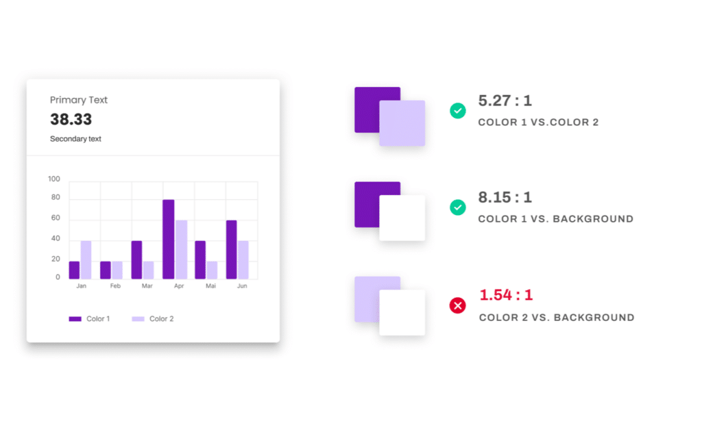
As a user gathering insights from data, I want to be able to distinguish color. In order for the palette to be effective in visualizations with as few as 2, and as many as 10 categories, the colors need to be sequenced in such a way that differentiation and diversity is evenly distributed.
Color Contrast Ratio is the ratio of the luminance of the brightest color (white) to that of the darkest color (black). According to the Web Content Accessibility Guidelines, the contrast ratio should be at least 3:1. For instance, if you’re using purple and light purple in a bar graph, they need to be distinct enough to meet this ratio.
Clarity Creates Confidence
As a user, I want to avoid the potential for false associations. A single red data point among blues and greens can scream “error.”
Keep it Simple
Too many colors can harm a user’s experience and create decision paralysis for a product designer facing too many options. As a design team, we do not want to add any additional colors to our current color library.
Represent Artera
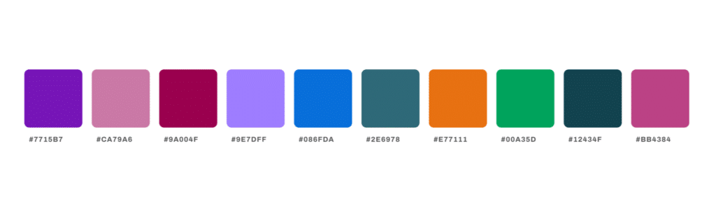
Accessibility is prioritized over beauty, but our palette should represent the brand, and be as attractive as possible. The first color in the sequential order should be our main brand color, Artera Purple.
The Process
Step 1: Testing Against White Background
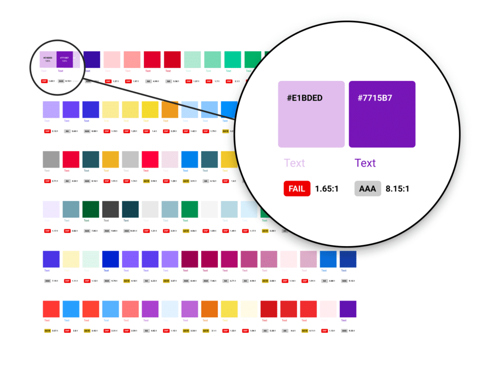
How might we eliminate the most colors from our palette quickly?We used a Figma Plugin called Contrast Grid to measure the contrast ratio of all 100 colors against a white background. This helped us quickly eliminate colors that didn’t meet the 3:1 ratio. Goodbye to 51 colors right off the bat!
Step 2: The Just Noticeable Difference (JND)
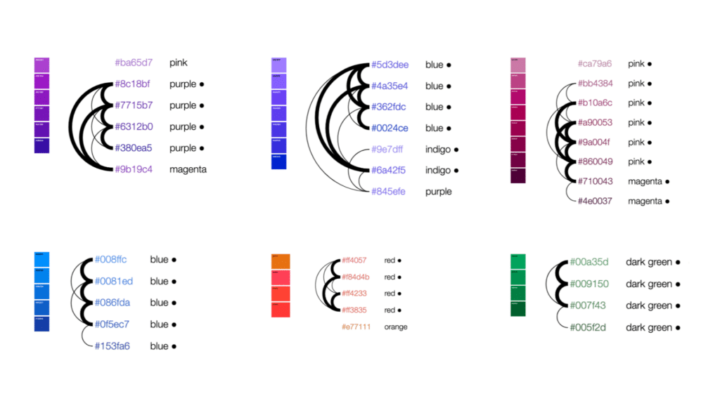
How might we measure the contrast of all color combinations in the palette as a group? Most contrast ratio tools only measure the differentiation between two colors. If we were to measure the contrast of all combinations of 51 colors, we would have to run 28,662 contrast ratio tests.
Instead, we did some research and used a tool called Viz Palette to examine the “Just Noticeable Difference.” JND, created by Nasa, is defined as “the amount something must be changed for a difference to be noticeable.” In the image below, colors that are difficult to tell apart are linked with increasingly thick arcs. For each hue, I eliminated the colors connected by arcs. Only 20 colors remain.
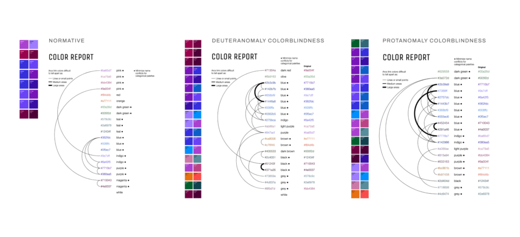
Step 3: Colorblindness Check
Using the JND test again, we focused on how the remaining 20 colors appeared to those with color blindness. We eliminated colors that were too similar, especially to our beloved Artera Purple. This left us with the final 10 accessible colors.
Final Touches: Ordering and Proximity
How might we create a default order to maximize contrast?
About 4% of the population would have trouble distinguishing 8 of the 90 color pairs when represented as thin lines or small points. We used the Contrast Grid Figma plugin one last time and listed the contrast ratios from highest to lowest for each color pair. Then we experimented with several palette orders and calculated the average contrast ratio of all neighboring colors.
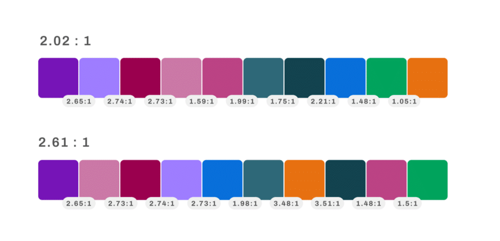
The Result: Artera’s Categorical Data Visualization Color Palette
After rigorous testing and tweaking, we proudly present our data visualization palette of 10 colors. It’s designed to maximize accessibility and highlight our brand. No additional color were added to our design library of 100 colors. The palette is fully 3:1 contrast-accessible against the background, and has an average of 2.61:1 contrast between neighboring colors. Since this falls short of the strict requirement of non-text contrast, we have built up a repository of color-agnostic features including divider lines, data tables, and tooltips. We are also considering adding some additional colors to our design system color palette — a blog for another day.
Our Commitment to Excellence
At Artera, we guide everyone to achieve their goals with confidence through clear language, organized interfaces and intuitive workflows. People feel empowered, never guessing what to do next. We aim for a smooth journey by understanding connections and standardizing patterns. Our experience is integrated and cohesive. People feel like they can get any task done with efficiency. We consider every design choice carefully. We craft exceptional experiences that build trust through visual appeal and high perceived value. People feel that our product is secure and performant.
About Artera:
*Artera is a SaaS digital health leader redefining patient communications. Artera is trusted by 800+ healthcare systems and federal agencies to facilitate approximately 2.2 billion messages annually, reaching 100+ million patients. The Artera platform integrates across a healthcare organization’s tech stack, EHRs and third-party vendors to unify, simplify and orchestrate digital communications into the patient’s preferred channel (texting, email, IVR, and webchat), in 109+ languages. The Artera impact: more efficient staff, more profitable organizations and a more harmonious patient experience.*
Founded in 2015, Artera is based in Santa Barbara, California and has been named a Deloitte Technology Fast 500 company (2021, 2022, 2023), and ranked on the Inc. 5000 list of fastest-growing private companies for four consecutive years. Artera is a two-time Best in KLAS winner in Patient Outreach.
For more information, visit www.artera.io.
Artera’s blog posts and press releases are for informational purposes only and are not legal advice. Artera assumes no responsibility for the accuracy, completeness, or timeliness of blogs and non-legally required press releases. Claims for damages arising from decisions based on this release are expressly disclaimed, to the extent permitted by law.

Design Creating a Feedback Loop
The Black Hole Emails, support cases, survey responses, phone calls, prospect notes, trade shows, onsite visits, pilot and beta programs.…

Bridging the Analytics Gap: Why We Are Reimagining Our Client Data Experience
The Challenge: Embedded Analytics That Fall Short At Artera, we’ve consistently prioritized providing our clients with powerful data insights. Until…

Design Systems in Healthcare Tech Companies
In the landscape of healthcare technology companies, maintaining a consistent and unified experience is critical. By building a well-structured design system, Artera aims to do just that.