Intro
At Artera, we work hard everyday to make it possible for patients to easily communicate with their healthcare provider using a medium that most of us would consider our most personalized and accessible – the mobile phone in our pocket. Using our platform, patients and providers exchange hundreds of millions of communications every year.
This massive volume of communication creates a lot of data that can help customers to optimize their processes and understand how to better serve their patient populations. The Data team at Artera builds reports, dashboards and other data products with this aim in mind. We help our customers to see the scale and outcomes of the outreach they are conducting, the patients they are reaching (or have yet to reach), and the types of conversations their staff are having with patients everyday.
We are extensive users of Google’s Looker platform, which is a browser-based business intelligence and data visualization tool that allows us to organize our data and make it easy to explore. It is a powerful tool, and we make it available to our customers via our Analytics Plus (standard reports built and managed by the Data team) and Self-Service Analytics (full access to Looker for clients to build their own custom dashboards and explore data) products. In recent years, we have begun trying to push the capabilities of Looker to make our reporting and analytics offerings more accessible, reliable and most of all, actionable. Below are some of the lessons we’ve learned along the way and how we’re incorporating them in our Data/Analytics roadmap.
Say no to cognitive overload
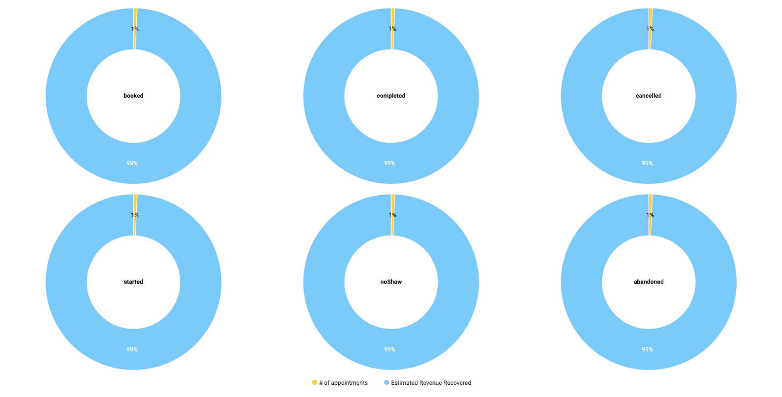

In the world of analytics and data visualization, it is common for dashboards to be filled with flashy gauges, graphs and tables that don’t communicate as effectively as the developer intended. As a result, it is all too easy to make an attractive and professional-looking data product that end users cannot derive value from or even understand what is being visualized.
At Artera, the primary “subject” of the data we provide are communications and the metadata that accompany them. We can easily provide a detailed table with all of the communications a customer has sent outbound in the past twelve months. We can include the category and text of each message, the recipient’s state, city, preferred language and phone number, whether there was a response, the sentiment of the response, and so on. We could also create an intricate network graph that includes these various dimensions. But is this valuable? Our task as the Data team is to tell the story the data contains within it. Often the simplest approach is the best. We generally try to focus our dashboards to a single topic.

We are purposeful about isolating a dashboard’s content to concern a given area of our product or their business. For instance, the “No-Show Recovery Dashboard” only provides data on the effectiveness of the no-show appointment follow-up outreach. The “Harmony Messaging Insights Dashboard” shows details about the outbound automated and manual messages a customer is sending. We try to start all of our dashboards at the top with displays of the most zoomed-out, top-line metrics. Then we are selective about which visualizations we include after that. A graph or two that takes the top-line metric and introduces other dimensions or a small table that provides more context is best. Then, “below the fold” at the bottom of the dashboard we generally provide a detail table that allows for quickly viewing data in bulk. This layout is common across most of our dashboards, and helps the user get what they need without needing to scroll or decipher what a complex visualization is saying.
Meet users where they are
As much as we love Looker reports, we recognize that the vast majority of our end users at Artera never see them. They are receptionists, contact center agents, or patient engagement specialists. They don’t have time or desire to dive into a separate application to view reports, they’re too busy communicating with patients using our platform, managing their practices and coordinating outreach efforts.
With this in mind, we have devised new ways to insert analytics directly into the workflow of every Artera user. Our first try was directly embedding Looker reports into the Artera platform. While this works as a method to give users access to data, it is not the most elegant solution. In 2024 we have worked on a new way to visualize data within the application as part of a project we have called “Native Reporting”. The data is still organized and provisioned by Looker, and if you were working in Looker you would see the same metrics and data points, but the look and feel is indistinguishable from the rest of the Artera platform. These analytics views are easily accessible to all users and don’t require a Looker account to access. In this way, we arm our customers with data even if they never access our browser-based dashboards.
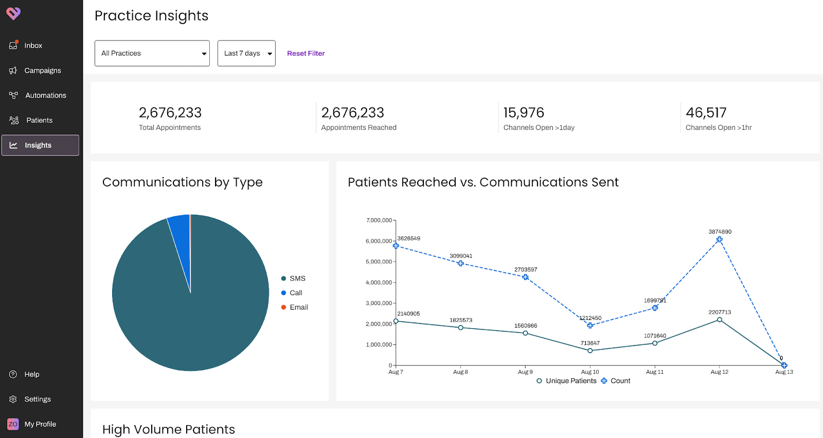
For leadership, enterprise-level users and more specialized roles, we still will have our existing Analytics offerings within Looker. This remains our go-forward strategy. But, now that Native Reporting is complete we have an extra decision point when designing a dashboard. Would this data be more useful built directly into the Staff view, or is it more relevant for a director or even a CMIO? In this way we can ensure we are meeting users where they are best able to take advantage of the information presented. We even recognize that some of our customers have their own Data teams and just want a direct feed of the data we produce. Today we handle that by exporting data out of Looker for them to ingest into their own systems.
Tell, don’t just show
The old adage to “show, not tell” is certainly useful in many respects, but often it is better to “tell, not show”. When visualizing data, we need to tell the user exactly what it is we are communicating and why they should care. Our Data team makes use of clear labels, notes and legends to ensure maximum comprehension. We also build our data products with simplicity in mind. Besides that, more customers want to know explicitly the outcomes and ROI they are getting from using Artera. In 2024 we have begun adding revenue estimates, staff efficiency and time saved metrics and other more specific ROI measures to our reports. We want it to be easy for customers to see the value of Artera.
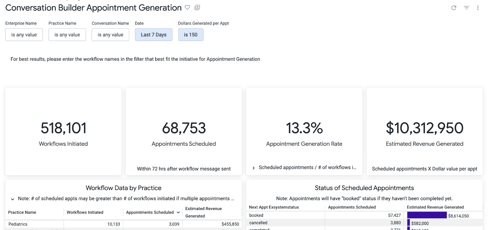
As mentioned above in the section on “Say no to cognitive overload”, modern data visualization design is replete with fancy graphs, gauges and tables. It can be fun to play around with a Voronoi diagram, heatmap, network graph, or other exotic visualization type. But, part of “telling, not just showing” involves explicitly pointing out the key message of the dashboard. If the dashboard is meant to communicate the effectiveness of a Campaign, nothing beats a simple table breaking down how many customers received it and took the action prescribed. For measuring ROI of using Conversation Flows, four single-value tiles that show how many flows were triggered, how many new appointments got scheduled, conversion rate and estimated ROI tells the story beautifully.
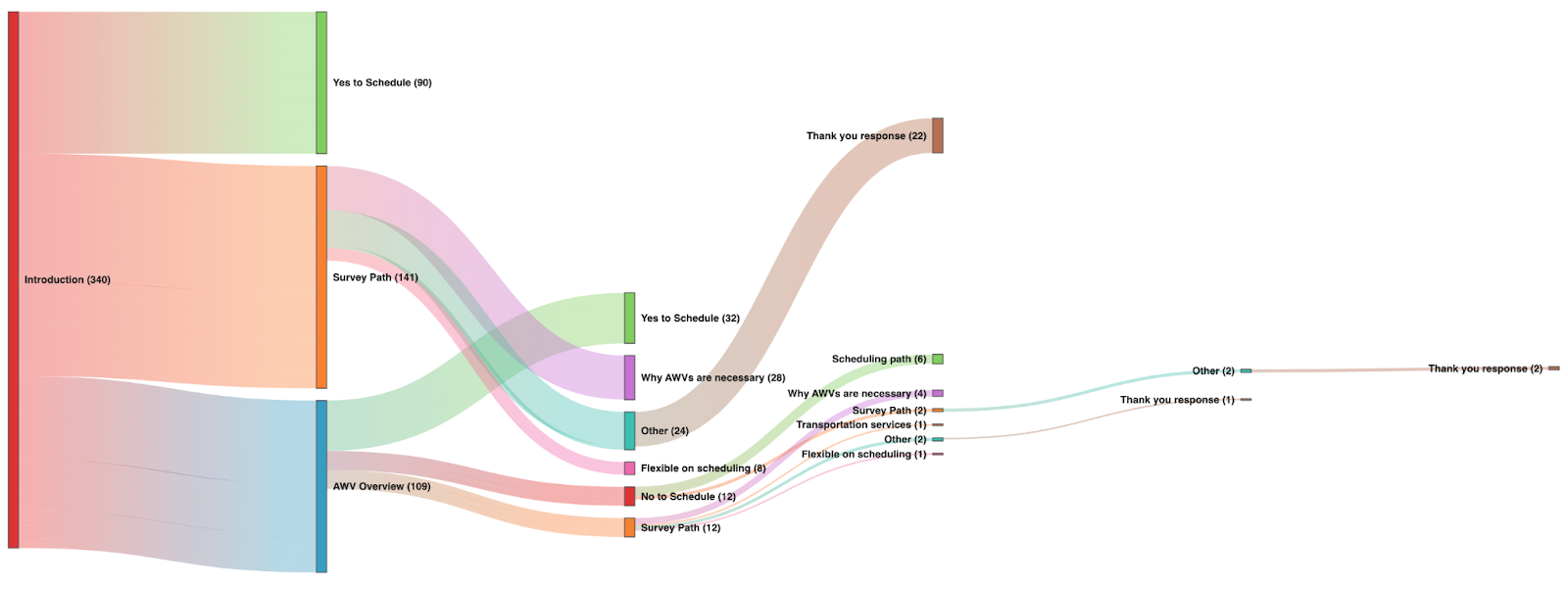
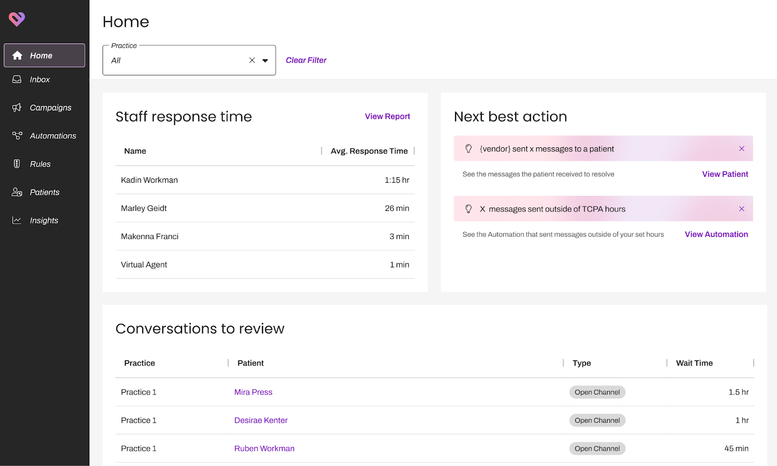
If a specific action or change is needed as a result of some insight we find in the data, it is obvious that our customers would prefer being told directly rather than needing to dig into a dashboard, no matter how to-the-point it may be. In 2024, we have begun generating “efficiency ideas” or opportunities for improvement like flagging practices with high no-show rates where the standard no-show recovery automated outreach has not been enabled, alerting about communications sent outside of TCPA hours or patients who are receiving a disproportionate volume of communications. Each of these “efficiency ideas” can spark a configuration change and can result in improved patient experience or recovered revenue. We will continue to add more efficiency ideas and guardrails, making use of AI and machine learning to find insights that are harder to suss out. All of these insights (in keeping with our second principle of “meeting users where they are”) will be directly visualized on a homepage view within the inbox and include links to take users directly where they need to take action. In this way we can tell, not just show, meeting users directly where they are.
We believe that the key to making reporting and analytics more actionable lies in the simplification of how data is presented, trying to avoid cognitive overload and focusing on telling a clear story with the most relevant metrics. To this end, Artera has integrated analytics directly into user workflows through Native Reporting, which makes data accessible without requiring separate dashboard access. We aim for explicit communication of outcomes and ROI, using clear labels, notes, and specific metrics to demonstrate the value customers get out of our platform. Lastly, we meet users where they are, with data presentation that is tailored to different user roles, from frontline staff to leadership, ensuring information is relevant and actionable for each user group. Together, these approaches are how to make reporting and analytics more actionable, understandable, and accessible for our customers.
About Artera:
*Artera is a SaaS digital health leader redefining patient communications. Artera is trusted by 800+ healthcare systems and federal agencies to facilitate approximately 2.2 billion messages annually, reaching 100+ million patients. The Artera platform integrates across a healthcare organization’s tech stack, EHRs and third-party vendors to unify, simplify and orchestrate digital communications into the patient’s preferred channel (texting, email, IVR, and webchat), in 109+ languages. The Artera impact: more efficient staff, more profitable organizations and a more harmonious patient experience.*
Founded in 2015, Artera is based in Santa Barbara, California and has been named a Deloitte Technology Fast 500 company (2021, 2022, 2023), and ranked on the Inc. 5000 list of fastest-growing private companies for four consecutive years. Artera is a two-time Best in KLAS winner in Patient Outreach.
For more information, visit www.artera.io.
Artera’s blog posts and press releases are for informational purposes only and are not legal advice. Artera assumes no responsibility for the accuracy, completeness, or timeliness of blogs and non-legally required press releases. Claims for damages arising from decisions based on this release are expressly disclaimed, to the extent permitted by law.


